
Most band logos exist to be recognized.
The KI BARAK SELEM logo exists to be contemplated.
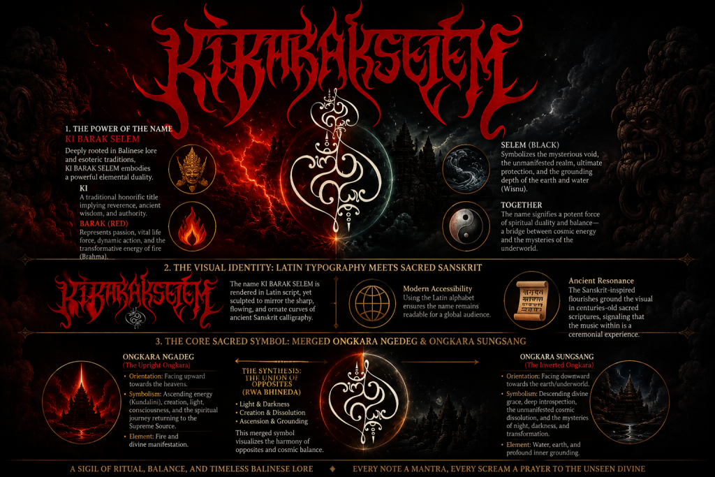
Behind every stroke, every curve, and every symbol lies a philosophy far older than the music itself. It is not merely a visual identity, but a spiritual signature—an emblem born from Balinese mystical tradition, expressing the eternal harmony between opposing forces.
Rather than serving as decoration, the logo functions as a ritual seal, inviting listeners to step beyond sound and into a world where music, philosophy, and ancestral spirituality converge.
1. The Power of the Name: KI BARAK SELEM
Before understanding the visual identity, one must first understand the name itself.
Deeply rooted in Balinese lore and esoteric tradition, KI BARAK SELEM embodies an elemental duality that has long existed within Balinese cosmology.
Ki
A traditional honorific title signifying reverence, wisdom, spiritual authority, and the presence of an elder or sacred being.
Barak (Red)
Red represents vitality, courage, dynamic movement, sacrifice, and the transformative energy of fire—an expression traditionally associated with Brahma, the force of creation and continual renewal.
Selem (Black)
Black symbolizes mystery, silence, protection, the unseen realm, and the profound stillness from which transformation emerges. It reflects the grounding qualities of earth and water and is traditionally associated with Wisnu, the cosmic preserver.
Together, these two colors express far more than visual contrast.
They reveal a philosophy where apparent opposites coexist—not as enemies, but as complementary manifestations of one universal reality.
The name itself becomes a bridge between visible and invisible existence, between life and mystery, between movement and stillness.
2. The Language of Colors
The dominant red-and-black palette is not simply inspired by the visual tradition of Extreme Metal.
Within the philosophy of KI BARAK SELEM, color itself carries symbolic meaning.
Red embodies living fire, courage, passion, sacrifice, and the transformative force that continuously reshapes existence.
Black represents protection, contemplation, the unknown, the fertile void, and the hidden dimension from which all creation ultimately arises.
Together they express the perpetual dialogue between manifestation and mystery.
Just as day cannot exist without night, neither force is complete without the other.
The colors themselves become an expression of Rwa Bhineda—the Balinese understanding that harmony emerges through complementary opposites.
3. The Visual Identity:
Latin Typography Meets Sacred Sanskrit
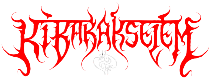
At first glance, the typography immediately evokes the atmosphere of traditional Black Metal.
A closer look, however, reveals a deeper intention.
The name KI BARAK SELEM is written using the Latin alphabet, yet every letter is carefully sculpted to echo the flowing elegance and sacred ornamentation of ancient Sanskrit calligraphy.
This synthesis serves two purposes.
Modern Accessibility
Using Latin letters allows the name to remain readable and recognizable to an international audience.
Ancient Resonance
The Sanskrit-inspired forms quietly communicate that this is not merely entertainment.
The music draws inspiration from centuries-old Balinese spiritual traditions, sacred texts, and mystical philosophy.
The logo therefore becomes a bridge between contemporary Extreme Metal aesthetics and an ancient cultural heritage that continues to live through ritual, symbolism, and oral tradition.
4. The Sacred Heart of the Logo:

Merged Ongkara Ngadeg & Ongkara Sungsang
Positioned beneath the typography lies the spiritual heart of the entire emblem.
The merged Ongkara Ngadeg and Ongkara Sungsang.
Within Balinese Tattwa, the Ongkara (Om) is the primordial vibration from which all existence unfolds.
Rather than presenting a single form, the logo deliberately unites two complementary manifestations.
Ongkara Ngadeg
The Upright Ongkara faces upward toward the heavens.
It represents ascending consciousness, spiritual awakening, creative fire, divine manifestation, and humanity’s journey back toward the Supreme Source.
Its movement is one of elevation.
Ongkara Sungsang
The Inverted Ongkara faces downward toward the earthly realm.
It symbolizes descending divine grace, introspection, mystery, dissolution, protection, and the transformative wisdom hidden within darkness.
Its movement is one of return.
5. Why Merge Them?
The question naturally arises:
Why combine both symbols into a single emblem?
Because existence itself is never one-sided.
Life unfolds through opposing currents that continually sustain one another.
Creation exists alongside dissolution.
Light reveals what darkness conceals.
Silence gives meaning to sound.
Birth is inseparable from death.
Rather than rejecting darkness, Balinese philosophy teaches that wisdom emerges through understanding the rightful place of every opposing force within the cosmic order.
By intertwining Ongkara Ngadeg and Ongkara Sungsang until they become one inseparable symbol, the logo visualizes the profound Balinese principle of Rwa Bhineda.
Not conflict.
Not contradiction.
Harmony.
The emblem therefore becomes an energetic center—a reminder that balance is not achieved by choosing one side, but by embracing the complete cycle of existence.
6. Beyond the Logo:
A Philosophy That Shapes the Music
The symbolism does not end with the artwork.
It extends into every aspect of KI BARAK SELEM.
The lyrical themes explore Balinese spirituality, ancestral wisdom, sacred philosophy, and mystical transformation.
The musical compositions move between aggression and serenity, chaos and contemplation, reflecting the same dualistic balance expressed within the logo itself.
Traditional Balinese elements coexist with modern Extreme Metal in much the same way that the merged Ongkara unites heaven and earth.
Every scream carries intention.
Every melody becomes reflection.
Every composition is conceived not merely as entertainment, but as a ceremonial offering expressed through sound.
Conclusion:
More Than a Logo
The KI BARAK SELEM logo is far more than a visual identity.
It is an invitation.
An invitation to look beyond appearances.
To rediscover the wisdom preserved within Balinese ancestral traditions.
To recognize that light and darkness are not opposing absolutes, but complementary expressions of one eternal reality.
Every curve of the typography.
Every line of the merged Ongkara.
Every contrast of red and black.
Together they form a sacred emblem that reflects the mission of KI BARAK SELEM:
to reclaim ancestral Balinese spirituality through modern, visceral art.
The logo is not simply meant to be seen.
It is meant to be contemplated.
Because before a single note is heard…
the journey has already begun.